More
- Category Name
- More..
Get an approximate budget for your kitchen design by sharing your space details.
Speak to our design professionals
Share your info, we’ll book your slot.
Will you be living in your space during the renovation?
 Previous Question
 Previous Question
Please Select Date and Day
Appointment Date & time

As Asian Paints announces ‘Cherish’, a soft, calming shade of green, as the Colour of the Year, we look at how people have enjoyed using this shade that is all about freshness and renewal
2020 was a rough year for all of us. The world retreated into their homes. Social distancing became the norm. And we probably indulged in more banana bread and Dalgona coffee than necessary!
As we slowly get vaccinated and move back to normal, there’s a sense of new life, hitting reset, and starting afresh. And that’s one of the things Asian Paints Colour Of The Year 2021 represents. Vibrance. Renewal. Energy. Nature. A shade of green that’s aptly named ‘Cherish’ - because if the past year has taught us anything, it’s that we need to appreciate and cherish the little things - especially the space we live in.
And after so much time spent locked up indoors, we’re all yearning for the outside – and the colour green is a great way to fill your home with a sense of nature. Green may not be the first colour that comes to mind when you think of home interiors, but the shade is actually a popular one, quite extensively used, and with a pointed cultural and psychological significance.
Colour is evocative. It can elicit memories and incite emotions; it can also have an impact on simple day-to-day decisions, from clicking on an ad to picking up a bottle of sauce at the grocery store. It also stimulates the senses.
Light/pastel green, in this regard, is seen as a calming colour with positive energy. It is considered restful to the eye, offers a sense of security, and can even stabilise the mind. It is the colour of balance, harmony, growth and restoration - all very important elements for your well-being, both within the home and outside of it.
Interior designer Shivani Dogra, the creative director at her namesake design studio, works with green in her projects for this very reason. She says, “I have used green in the past, and continue to use it is because it is soothing, and it’s not as boring as white and beige. Green is the colour of nature that’s all around us. And it’s also easy to layer green with other natural elements.”
In design, too, light green is associated with coolness and calm, and can be used outdoors as well. Being a shade that doesn’t take in too much heat, it is a popular choice for home exteriors down South and in Rajasthan, where the temperatures are warmer.
Dogra says that in Nawalgarh in the Shekhawati region of Rajasthan, pastel green shades are common, often used as a base against bright pinks and blues.
Architect Ali Baldiwala, partner at the Mumbai-based firm Baldiwala Edge, says that the use of green in Indian interiors goes back a long way – 40-50 years ago, green Baroda marble was a popular choice for a lot of inlay work as well as panelling in floors and skirtings.
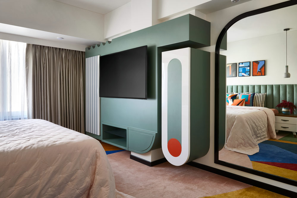
He too, loves the shade for its ability to mimic nature. For a recent project he wrapped up, he worked with olive and pistachio hues. Green 3D textured tiles from Europe were used in the bathroom, in a shade of pista green. The same hue was used for the headboard of the bed (in suede) as well as in the TV console. This points to the versatility of the shade, says Baldiwala, as it can be incorporated in a number of ways by utilising different textures and materials.
Green can have varying effects, depending on where its used - but in general, it makes a space feel larger. Light green is said to create a protective atmosphere when used on the ceiling. Mild green tones create a cool and calm feeling when used on walls, and a relaxing atmosphere when used for flooring. And currently, the shade is trending, according to colour theorists.
Susan Mathen, co-founder & strategist at Delhi-based brand consulting studio Hue & Why, says they are seeing muted hues, neutrals and calming shades becoming popular. “In our Post Pandemic Trend Report, we identified two trends - one, Mindful Essentialism, which is all about making do with just enough; and two, Lusting For The Mundane which is inspired by the fact that we have all been locked up indoors and have started cherishing small things in life like a walk in the park, clear skies, etc, and pale green is a part of this palette.”
Which brings us back to our colour of the year, Cherish. A pastel shade, it does provide a sense of being in nature and of openness. Cherish, and colours adjacent to it, work very well for walls: calm, sophisticated, and with a cool, understated elegance.
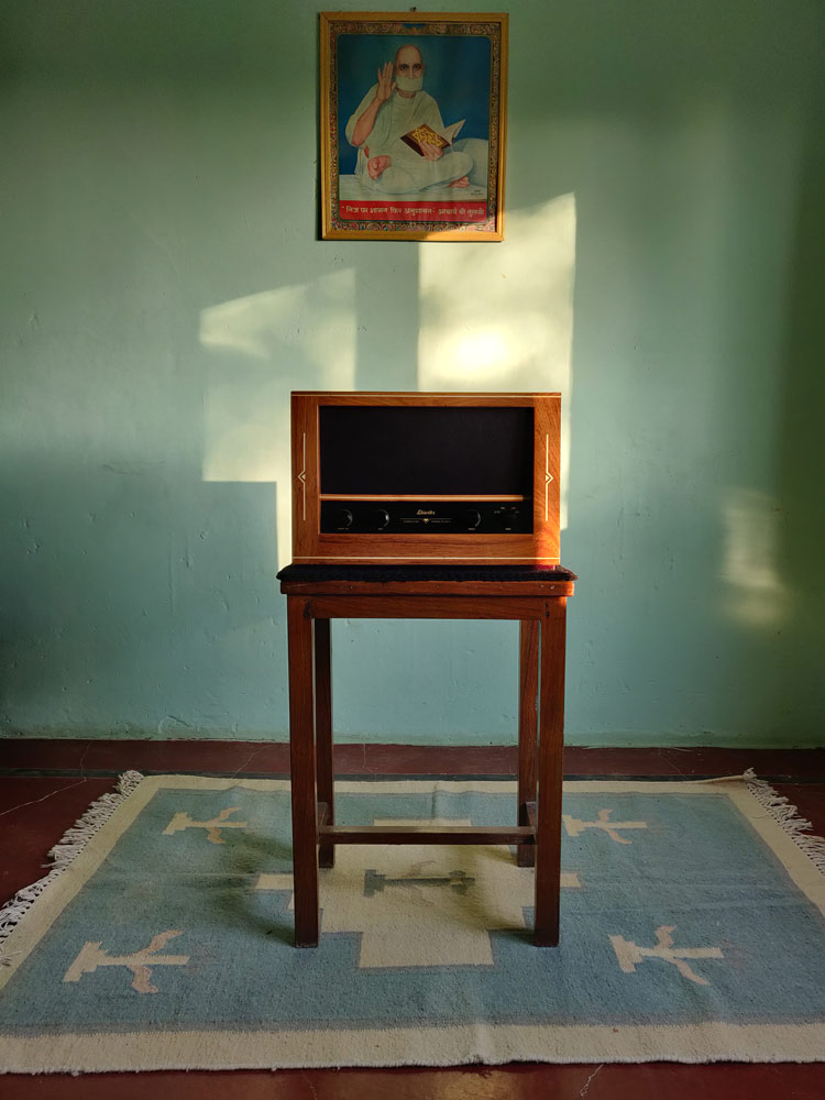
The shade is also a clean slate against which one can showcase paintings and objet d’art, and make them pop, or blend in, like speaker brand Diwiks. If you check out their Instagram page, you’ll find many of their products displayed against a pista green wall. It immediately grabs your attention and keeps you scrolling!
Diwik Singh Chanchlani says, “For me, the green I use is drawn from nature extensively. A lot of my work is inspired by the Art Deco and Mid-Century Modern movements, and many old havelis in Bikaner (where I’m based) also use this shade.” He adds that the speakers they make are crafted using long-lasting wood and draw on earthy tones – and green embodies that tonality, allowing the product to blend in.
So, if you’re looking to give your walls a touch-up, or your home a spruce-up - give Cherish a go!
Drop your info and we will call you to book your preferred consultation slot our experts will reach out to you.
Yes, I would like to receive important updates and notifications on WhatsApp.
By proceeding, you are authorizing Beautiful Homes and its suggested contractors to get in touch with you through calls, sms, or e-mail.
Our team will contact you for further details.
We were unable to receive your details. Please try submitting them again.


