More
- Category Name
- More..
Get an approximate budget for your kitchen design by sharing your space details.
Speak to our design professionals
Share your info, we’ll book your slot.
Will you be living in your space during the renovation?
 Previous Question
 Previous Question
Please Select Date and Day
Appointment Date & time

ColourNext’s forecast themes provide a mix of inspiration for every space in any home
We’re always looking for inspiration when it comes to styling our homes—be it for the entire house or for a quick makeover to spruce up a room. But with the sea of ideas available at the click of a button online, it’s tough to distill exactly what we want, and what will actually work in our home. “Today, the nature of homes has completely changed, where a single space needs to have multiple personalities,” explains Manju Sara Rajan, editor-in-chief at beautifulhomes.asianpaints.com when describing Asian Paints’ business of innovating not just colours, but textures, wall coverings and finishes.
Through the years, the paint giant has developed a range of products and services to make the journey of building a beautiful home an easier one. From its one-stop décor shop AP Homes to the all-encompassing Beautiful Homes Service—Asian Paints is on a constant mission to simplify this process for a homeowner. With its in-house forecast team ColourNext (the only initiative of its kind in the country), it develops trend forecasts and a ‘hero’ known as the Colour of the Year. “ColourNext, and the spectrum of offerings from it, tries to give the design community inspiration year after year—to give people ideas and show them possibilities that go beyond neutral palettes and safe colours. The ColourNext project is really about colouring the home and all the sum of its parts,” she relates.
This year, ColourNext has forecasted four trends that are a culmination of behavioural patterns. They address socio-cultural topics ranging from mental health, digital currency and work choices to breaking gender barriers in fashion and décor.
Un-gendering spaces
The fashion industry has always tried to create a dialogue and question the need for gender stereotypes, from the colour to the silhouettes every convention has previously dictated. This has quickly spilt into other disciplines of design, especially home décor, where the conversation is quickly gaining momentum over the past few years. Today, it feels dated to stick to pink for a daughter’s nursery or only using muted, neutral tones for a bachelor’s home.
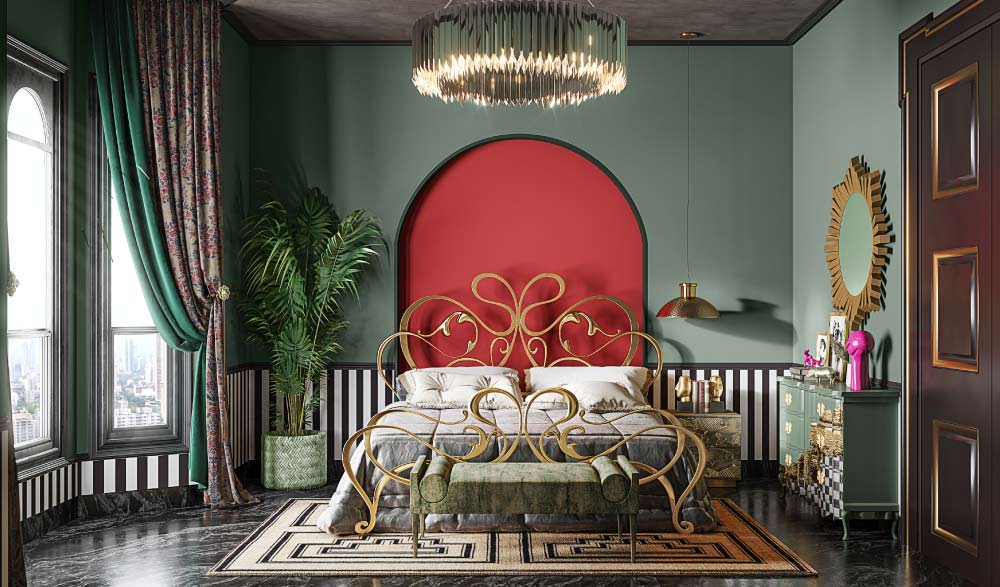
By breaking the established notions of gendered objects, we are no longer held back by what society dictates. The colour palette for We/Us is meant to spark a sense of adventure with bold shades that echo a sense of liberated confidence.
THE PALETTE…comprises cooler hues with fresh undertones (such as pista green and sea foam) balanced against bolder shades of mustard, dusty rose, a blue-ish red, and moss-grey.
THE STYLE GUIDE…layer each shade to build an element of surprise. While the lighter, whimsical hues evoke openness, the bolder tones will make a statement or create a focal point in a room.
A meta-verse of possibilities
Cryptocurrency, blockchain, NFTs…everywhere you turn, this new digital form of currency and investment is what everyone’s talking about right now. Recently, we’ve witnessed NFTs disrupting the power structure of the art world, where artists now have direct access to collectors. Eschewing the traditional route of valuation via curators, galleries, representatives and auction houses, it leaves the notion of art and its valuation open to interpretation.
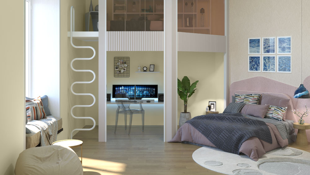
Artify’s transient colour palette that’s meant to explore and push boundaries of creativity with an interplay of contrasting shades that are spirited and futuristic.
THE PALETTE…perceivably simulated colours with grey overlays such as misty lilac, creamy ecru and sonic blue paired with lighter, delicate hues of pale lemon, power pink and crystal green.
THE STYLE GUIDE…this ephemeral colour palette captures a sense of curiosity and exploration. It also has a dream-like charm, evoking a momentary escape from reality. This versatile palette that will work perfectly in a home office or studio, or for a study corner in a child’s bedroom.
Empathy. Acceptance. Wellbeing.
If there’s one positive thing that came out of the pandemic, and its many long-drawn lockdowns, it’s our awareness and conversations about mental health. We’re beginning to notice a positive shift in society, where there’s a collective feeling of empathy to one’s mental well-being, and it’s impact on a productive future. This brings about an air of pensiveness and vulnerability, and a resilience towards being constant works-in-progress.
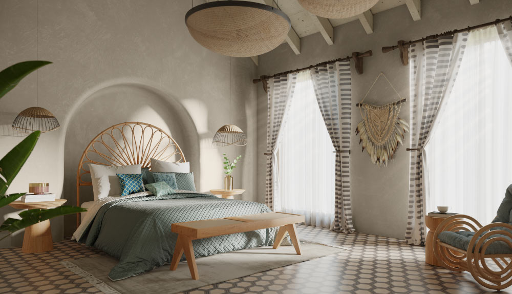
The shades in this trend forecast are meant to be perfectly imperfect, with each colour having a strong story—much like every individual.
THE PALETTE…an uplifting spectrum of creams and peach, along with an introspective and complex trio of weathered pink, greige and slate.
THE STYLE GUIDE….while this represents finding a balance within a roller coaster of emotions, we’d either choose our favourite shade for a cosy nook or corner in the home, or paint a panel along a wall to brighten up a room.
The life of gig-entrepreneurs
Over the past couple of years, the face and lifestyle of being an employed individual has completely transformed. While most full-time employees have found a way to productively work from home, a large percentage of the work force has found a new way of working through freelance or entrepreneurial careers. This paradigm shift in employment has allowed individuals the autonomy of location, lifestyle and time, which they’d like to sustain in a post-pandemic world.
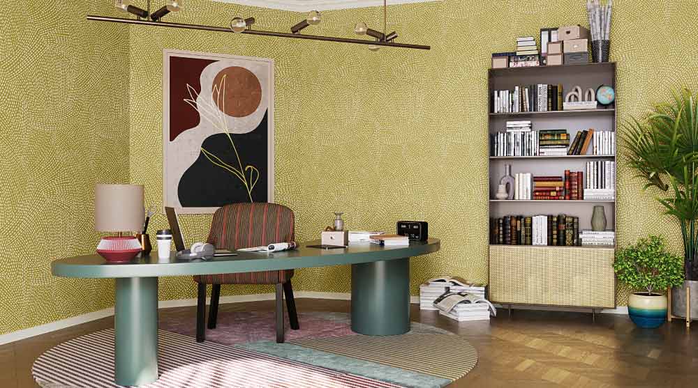
This lifestyle choice has led to temporary or impromptu office set-ups, or other smart alternatives. Solo Commerce celebrates this spirit of self motivation and disruptive flexibility.
THE PALETTE…neutral and reliable shades of nature such as pale cream, taupe and dusty teal juxtaposed against a bright burst of inspiring hues like mustard, jade and peach.
THE STYLE GUIDE….the styles we choose immediately reveal our personal tastes, thoughts and choices, especially in our home. If you’re looking to create a designated work space within your home or bedroom, choose one of the shades in this palette to section off the area.
Drop your info and we will call you to book your preferred consultation slot our experts will reach out to you.
Yes, I would like to receive important updates and notifications on WhatsApp.
By proceeding, you are authorizing Beautiful Homes and its suggested contractors to get in touch with you through calls, sms, or e-mail.
Our team will contact you for further details.
We were unable to receive your details. Please try submitting them again.


