


Kitchens
- Category Name
- Kitchens
Speak to our design professionals
Share your info, we’ll book your slot.
Get tailored made designs from our interior design services by asian paints.
Will you be living in your space during the renovation?
 Previous Question
Previous Question
Previous Question
Please Select Date and Day
Appointment Date & time


A new wave of homeowners and designers are breaking away from the chromatic conservatism of beige and brown. Here’s how personal taste and cultural confidence are colouring modern Indian interiors
There was a time not too long ago when the Indian colour wheel for home interiors rarely spun beyond cream, beige, brown or pale pista. Walls were always white, ceilings even whiter and colour, if it made an appearance at all, was relegated to a stray embroidered cushion or a multicoloured bedsheet. But that’s changing, and fast.
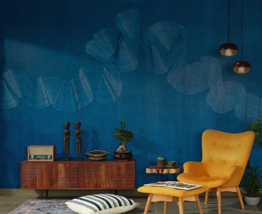
A new wave of homeowners and designers are breaking away from this chromatic conservatism, ushering in an era of bold choices, personal expression that embraces vibrant colours. Walk through newly built flats in Mumbai, Bengaluru or Delhi and you’ll see it: teal kitchen cabinets, electric blue sofas and even black walls. From dopamine interiors to maximalist nostalgia, the quiet tyranny of beige has finally been broken. This is not just a passing trend. It is, as many designers agree, a cultural reclamation.
The roots of beige supremacy run deep. Liberalisation in the 1990s brought with it a flood of Western design magazines, international catalogues and a desire to emulate minimalist, ‘tasteful’ aesthetics. The result was a domestic visual language stripped of regional nuance, skewed towards grey, taupe and ‘egg-shell white’. Minimalism became synonymous with sophistication, where the absence of colour signalled refinement.
Mumbai-based interior designer Shabnam Gupta, who works extensively with celebrity clients and hospitality brands, is one of the few people who’ve helped colour shed its reputation as juvenile or chaotic. “I think Indians in general are far more confident, experimental and proud of their roots than they ever were,” she says. She is the founder of The Orange Lane Studio, retail brand Peacock Life and has built a practice known for its eclectic, colour-rich spaces. “Earlier, we would ape the West. Now it’s about being contextual—about your own likes, dislikes and your personality.”
Pavitra Rajaram, who wears two hats—Design Director at Asian Paints and founder of her own design firm Rajaram Design—is perhaps best positioned to comment on this collective awakening. “Colour is culture, particularly in India. The names of our colours come from lived experiences like tota (parrot green), phalsa (a reddish-purple fruit), asmani (sky blue). In Tamil, there’s mayil kazhuthu which it literally means the neck of the peacock. It refers to a precise teal-blue shade that exists only in that bird,” she explains. “It’s not just poetic but it’s deeply embedded in how we perceive and remember colour. What we’re seeing now is a return to our natural way of decorating.”
I’ve watched this change unfold not only through the lens of my work but also at home. Growing up in the 1990s, my first home was all Kashmiri woodwork and heavily framed tapestries that covered most of the walls. When we moved into a more affluent neighbourhood in Mumbai, my mother declared that our new home would be entirely white—walls, ceilings and flooring too. Except for one thing—her wardrobe doors. She had them covered in a geometric print and topped with glass. That one statement has been the highlight of the house ever since.
Years later, when we renovated again in the 2010s, she still chose cream-coloured marble but this time added a shimmery ivory-gold accent wall (the textured kind that had just entered the market and felt thrillingly new) and bright floral fabric from Marimekko on the cupboards. Today, she has a hand-painted mural of flowers spray-painted onto the same wardrobe shutters in tones of sky blue, orange and pink. And the rest of the house? Still white.
The difference now is that the white is a choice, not a default. And that a mural doesn’t feel like a radical decision, it feels natural. The arc from fearful experimentation to confident self-expression is evident in how so many of us now approach colour.
What might have remained a gradual evolution to bringing more colour into the home became a revolution through the dual catalysts of pandemic lockdowns and digital inspiration. “People spent six months at home and realised their houses should look better. Even my friends who never cared for interior design started asking me what plates to serve in,” says Devika Narain, who runs a wedding design studio best known for creating high-profile ceremonies across India. The pandemic brought on an era of nesting. And as we began spending more time inside, we wanted our homes to reflect not just our routines but our personalities.
Designers also agree that the visual culture explosion—Instagram, Pinterest and even OTT platforms—has fuelled the movement. “I’d say the shift began about four or five years ago and it’s really gathered momentum over the last couple of years,” says Pavitra. “You now have access to hundreds and thousands of visuals of homes, of people using colour, of what their spaces look like. That volume of visual content is immense."
On Instagram, colour has found a new language. The dopamine interiors trend, which started gaining traction around 2021, is now everywhere: disco ball pendant lights, pastel kitchens, checkerboard floors and wavy mirrors. At the forefront of this aesthetic are designers like Swedish creator Gustaf Westman, whose now-iconic wavy mirror is not only viral but it has also become a visual shorthand for playful, modern interiors. Closer home, the shift is just as visible—you can now walk into stores and pick up a sunshine-yellow sofa, a lipstick red table lamp or even a bright green version of the ever-popular Billy bookcase.
Devika explains how her own journey with colour charts this evolution. Raised in a home surrounded by gardens, decorated with bright curtains and floral sofas, her aesthetic has always been rooted in colour. “I have a theory,” she says. “You can tell how evolved someone’s aesthetic is by the amount of colour they use at home. Everyone starts with the white-walled look. Then slowly, a cushion comes in, an artwork, a painted wall.”
In her current home, Devika has an L-shaped wall painted black in her study, paired with a black-and-white wallpaper from Asian Paints on an adjacent wall. The house has been styled entirely by instinct, without any formal interior design training, and she describes her decorating process with an almost sartorial analogy: “I think your home is a lot like what you wear. You get up in the morning and you pick a mood and colour is a part of that mood.” For her, green is a neutral shade and the décor shifts constantly with the seasons. “I’ve brought out objects and linens in lavenders because a lot of my wildflowers are in bloom now,” she says. “There will be yellow cushions when the sunflowers arrive.”
Shabnam, too, shares an evocative picture of her own bedroom: “I have birds and butterflies and whimsical trees painted behind my bed. The headboard is Jamdani woven, with a thread work featuring the tree of life. But the rest of the room is off-white. When I wake up, I see quiet. But when I enter the room, I see joy.”
Arun Shekar, a designer based in Kochi and co-founder of Humming Tree studio, recounts a vivid project in Bangalore where the living room was painted a deep Russian blue. “The couple loves to party, entertain guests with cocktails. The darkness suits their lifestyle,” he explains. “Their child’s bedroom is jungle green and their guest room is terracotta, both a nod to their Assamese roots.”
He says that exposure to international travel also plays a key role in colour selection. “When people travel, they see homes abroad that use darker palettes or bold colour in a confident way. They return saying, ‘Why not try that here?’ Now clients more open to testing, to sampling, to playing around with wall colour and furnishings before committing.”
In many cases, it’s the clients themselves who lead the charge. Arun recalls Chitra and Raghunath, a couple in their late 50s who had lived in Mumbai and travelled extensively. During their travels through Portugal and Spain in their mid-30s, they fell in love with colour and pattern and decided they wanted their next home to reflect that same spirit. “They wanted orange, red, blue, houndstooth, patterns on patterns in their Bangalore home,” says Arun. “They’d gone to other architects who said no. But they told us, ‘We don’t care what anyone thinks. This is who we are.’”
That project became a riot of contrasts: colour-blocked walls, sculptural furniture, layered textures and maximalist joy. “I gave them a safe first cut,” he says. “They called me disappointed. Then we went bolder. And now that’s the house they love.”
Designers say the shift now is as much about mindset as it is about access. And the market has responded. “Earlier, you had to hunt in places like Amar Colony in Delhi to find painted furniture,” says Devika. “Now, brands across price points are doing colour.”
India’s design market has followed its own rhythm. A dacade or more ago brands like Play Clan and Chumbak were just starting to gain momentum with their rickshaw motifs and Bolly-pop icons. Back then, colour was still mostly reserved for quirky cushions or illustrated coasters. Rarely the wall. Rarely the furniture. But somewhere between that phase and now, colour’s grown up.
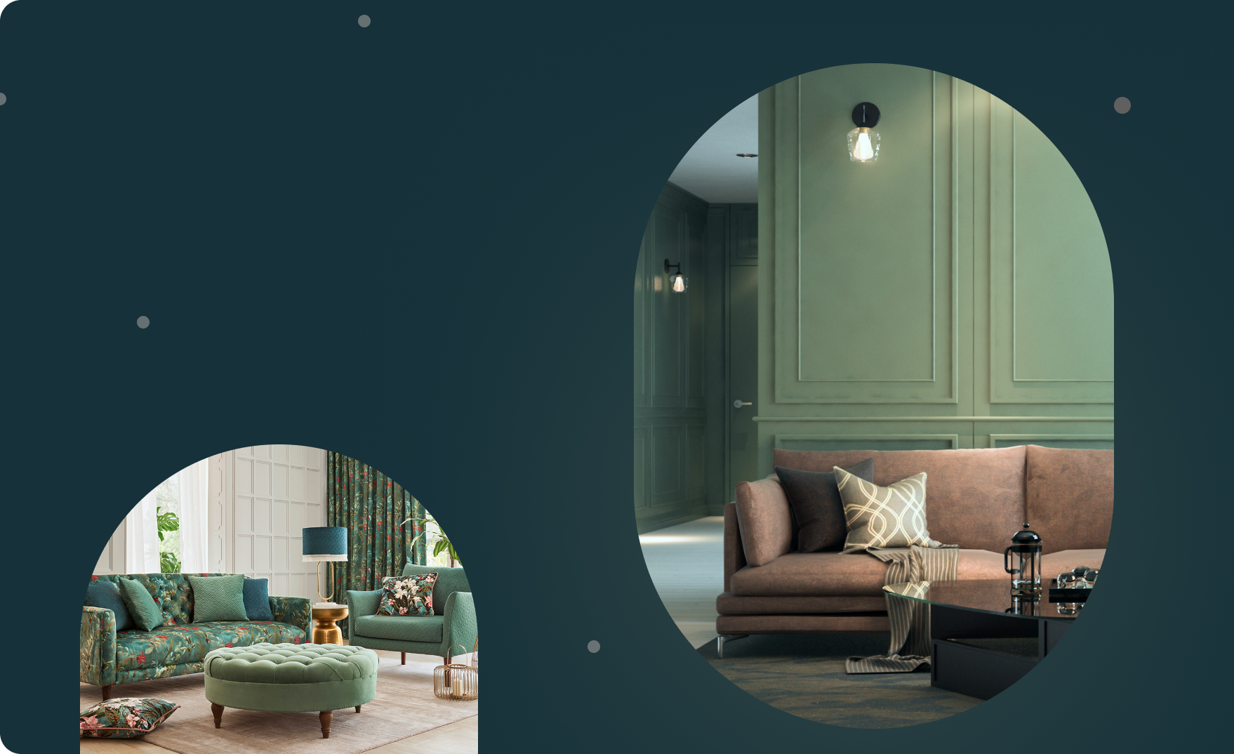
Emerald sectionals and mustard-yellow armchairs are popular, rugs also have become anchors of expression with brands offering contemporary designs rooted in Indian craft. Even tech has turned aesthetic: TVs come with ‘Art Mode’ and wooden frames.
avitra’s words are underscored by Asian Paints’ launch of Chromacosm in 2024, a system that’s expanded their offering from 3,500 shades to over 35,000 colours grouped not just by hue, but by emotion, narrative and application. It marks a new chapter where colour selection isn’t just about tone, it’s about storytelling. People don’t want ‘yellow’ anymore. They want ‘warmth’. They want ‘sunlight at dusk’. And the industry is finally ready to meet them where they are.
What’s important is that this isn’t a moment, it’s a movement. And it isn’t about being trendy. It’s about being seen. People are finally treating their homes the way they treat their wardrobes or their playlists—as extensions of themselves. Not everyone will paint their living room yellow. But more and more are ready to try.
And in this movement, India is not catching up. It’s coming home.
Small injections of colour, through a single rug, cushion or artwork, can transform how a room feels. “If it sparks joy daily, build from there,” says Shabnam Gupta. It’s not about planning a whole palette. It’s about starting with one moment of colour that feels true to you.
Jumping straight into saturated colour can be intimidating. Arun Shekar suggests easing in with softer, earthier hues like sage, desert sand or mint green. These tones feel familiar yet fresh, helping you transition away from an all-white mindset.
One strong design element, like a bright blue sofa can be the anchor for a room. “Decide whether to contrast or harmonise everything else,” says Pavitra Rajaram. This focal point simplifies decision-making and keeps your space feeling cohesive.
Working within a single colour family can create depth without drama. “Layering indigo with sky blue or emerald with moss gives you a ‘dhoop-chaon’ effect—light and shadow in the same tone,” Pavitra explains. The result is dynamic and delicate.
Powder rooms, entryways and vestibules are ideal testing grounds. “You don’t sit there, so you can experiment,” says Pavitra. A splash of unexpected colour in these spaces creates surprise without overwhelming your everyday environment.
One myth that often keeps people from colour is the idea that darker shades shrink a space. Pavitra disagrees. “A deep tobacco, a rich emerald—these can make rooms feel sophisticated. I often use dark colours in small spaces to create a sense of enclosure and drama.” She recently painted her sitting area a dark tobacco brown. “Many would consider it a dead colour but it came out beautifully.”
Arun adds one important caveat: use dark tones only where you have ample natural light. “Never use them in places like dressing rooms where you need clarity,” he says. “But for bars or lounges? Go all in.”
Drop your info and we will call you to book your preferred consultation slot our experts will reach out to you.
Yes, I would like to receive important updates and notifications on WhatsApp.
By proceeding, you are authorizing Beautiful Homes and its suggested contractors to get in touch with you through calls, sms, or e-mail.
Our team will contact you for further details.
We were unable to receive your details. Please try submitting them again.