


More
- Category Name
- More..
Get an approximate budget for your kitchen design by sharing your space details.

Search for Kitchens Wardrobes Doors & windows Curtains & Blinds Bathware Lights Design Ideas


Kitchen Budget Calculator

Speak to our design professionals
Share your info, we’ll book your slot.
Get tailored made designs from our interior design services by asian paints.
Will you be living in your space during the renovation?
 Previous Question
Previous Question
Previous Question
Please Select Date and Day
Appointment Date & time


The interior designer behind Essajees Atelier reflects on the shift in Indian interiors from beige minimalism toward a more expressive, layered palette
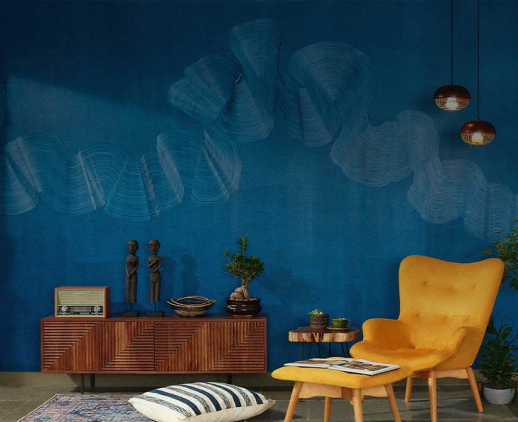
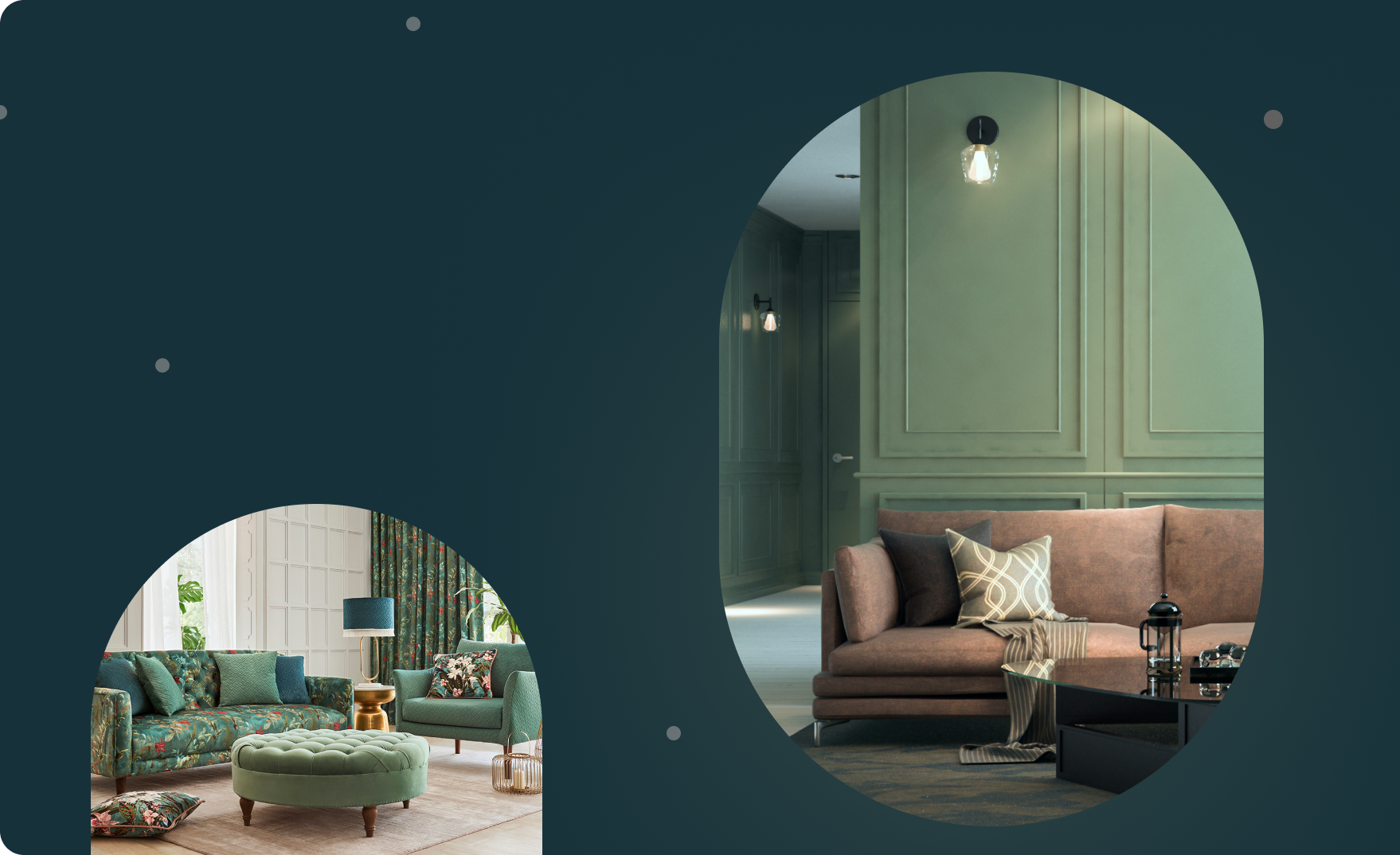
For a long time, colour in Indian interiors was treated with caution—contained to an accent wall, some soft furnishings or a single bright rug against a sea of neutrals. But that restraint, Sarah Sham suggests, was never truly ours to begin with. “Indian homes were always centred on rich arts and crafts,” she says. “It was Western emulation that made us mute our palettes.” Her perspective is part of a broader design shift we explore in our ongoing series on colour in Indian homes where Indian designers, homeowners and creatives are reclaiming colour as a tool of identity, emotion, and expression. (Read more here.)
As the fourth generation in the Essajees family—whose century-old firm in Mumbai has long dealt in antiques, art and bespoke furniture—Sham brings a layered perspective to colour. She grew up surrounded by objects steeped in history, fine craftsmanship and echoes of India’s artistic and architectural heritage. Today, as principal designer at her firm Essajees Atelier, she draws on that legacy to create spaces that feel intimate, expressive and rooted in the Indian context.
In this conversation with Beautiful Homes, Sham speaks about the return of personal expression in Indian interiors, how clients are navigating the pull between trends and individuality and why colours like yellow ochre and dusty pink deserve more space in our homes. Edited excerpts from the interview:
Sarah Sham (SS): My perspective is different; I see this not as newfound courage but as a powerful return to form. Indian homes were always centred on our rich arts and crafts, but a period of intense Western emulation took hold, favouring muted, standardised aesthetics. More recently, we’ve been consciously decolonising our tastes, a cultural shift that coincides with India’s rise as a global power. As our national influence grows, so does our collective confidence to look inward for inspiration. This renewed pride is now being beautifully and boldly expressed in our interior design, creating spaces that are more layered, colourful, personal and unapologetically Indian.
SS: The classic Indian aesthetic was often a ‘more is more’ philosophy, a curated maximalism involving a rich layering of objects, patterns and textures. In today’s context, however, this approach requires radical rethinking. Our urban living spaces have become significantly smaller, making grand, traditional pieces like ornate four-poster beds impractical.
Modern homes, often under 1,000 sq. ft., demand smart, multi-functional furniture where every item must justify its footprint. The luxury of space has been replaced by the necessity of function. This is where I realised that colour, when used thoughtfully, becomes the most powerful tool. It can create depth, build character and provide the visual richness that objects once did, achieving a maximalist spirit without overwhelming a compact home.
SS: While most colours work beautifully in Indian spaces, I am particularly drawn to those with deep cultural resonance. Yellow ochre is one such shade; it evokes the sacredness of haldi, the warmth of Jaisalmer stone and the timeless luxury of old gold. It has an inherent richness that is often underestimated.
Similarly, a dusty, muted pink feels intrinsically Indian. It’s the colour of aging Mughal frescoes and weathered pink sandstone, echoing the historic walls of Jaipur. These hues challenge the idea that colour must always be a loud ‘statement’. Instead, they offer a quieter, more textural way to build atmosphere, rooted in our own heritage.
SS: While I have a personal affinity for colour and believe it brings energy and comfort to a space, my professional practice is fundamentally client centric. If a client desires a neutral palette, we are dedicated to delivering that vision beautifully. However, when a client is open to embracing colour, we enthusiastically collaborate with them. Ultimately, when it comes to urban homes, there is no such thing as ‘too much’. The only right answer is what makes the homeowner happy in their own space.
SS: I don't believe there’s a single, directional trend in colour preference. It remains a mixed landscape defined by individual tastes, not a monolithic movement. We’re currently seeing two polarising micro-trends emerge simultaneously. On the one hand, the widespread obsession with serene, neutral palettes, often fuelled by social media, is making clients more conservative with colour, seeking a calm refuge. Concurrently, the joyful rise of maximalism champions pattern and personality, encouraging those once hesitant to become more adventurous with bold hues. This isn’t a linear shift but a dynamic interplay, proving that clients are choosing personal expression over any single, overarching trend.
SS: Colour should be a versatile tool, entirely adaptable to your vision. It can be the protagonist of a room with a bold, dramatic statement or it can play a subtle supporting role, weaving through textiles to create a cohesive mood. It can be applied loudly or softly. Ultimately, there is no right or wrong. The only guiding principle is creating a space that feels authentic to you.
A strategic way for homeowners to experiment with colour is by layering it through flexible, non-structural elements. This low-risk approach builds confidence. Art is a powerful tool for this, as are soft furnishings like cushions, throws and rugs. By confining bold colours to these easily changeable items, you maintain complete control and versatility. You can allow a single piece of art to serve as a dramatic focal point, anchoring the room’s colour story against a neutral backdrop or weave a dynamic palette through smaller accents. This method ensures your foundational space remains timeless while your décor can evolve with your tastes.
SS: To me, colour is synonymous with life’s most vital forces. It’s not just an aesthetic choice. It’s a direct source of happiness and a current of palpable energy. The more I can surround myself with vibrant hues, the more a space feels animated and full of possibility. My philosophy is simple: more is always better.
All images courtesy Essajees Atelier
Drop your info and we will call you to book your preferred consultation slot our experts will reach out to you.
Yes, I would like to receive important updates and notifications on WhatsApp.
By proceeding, you are authorizing Beautiful Homes and its suggested contractors to get in touch with you through calls, sms, or e-mail.
Our team will contact you for further details.
We were unable to receive your details. Please try submitting them again.