





















Kitchens
- Category Name
- Kitchens


Speak to our design professionals
Share your info, we’ll book your slot.
Get tailored made designs from our interior design services by asian paints.
Will you be living in your space during the renovation?
 Previous Question
Previous Question
Previous Question
Please Select Date and Day
Appointment Date & time


A three-storey flat in Ahmedabad is all about a neutral aesthetic that introduces pastels in restrained doses
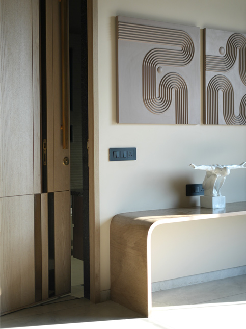
For a home shaded in creams and beiges, it can be a delicate balance to not tip over into monotony. That becomes just a bit more challenging when the house is a show flat with a nebulous future homeowner. “This house belongs to no one and, at the same time, to anyone who comes to visit as they contemplate its potential as a future home. It was important to keep that in mind,” says designer Shweta Pandya and co-founder of Architects at Work. This three-story Ahmedabad home, spanning approximately 3,000 square feet, therefore had to have expansive appeal. Within a neutral palette, Pandya and her team managed to create that elusive sense of home with measured doses of colour, texture and nature-inspired motifs.
Shweta Pandya (SP): This is a show flat, so people with diverse tastes will be dropping in to see it. The idea was to keep things light and ensure the interiors held largely universal appeal. Anyone walking in through the door would be viewing the space as a potential homeowner. They look at it through the lens of their imagination. They consider how it lives up to their own idea of home, and its possibilities for their future. So, making it feel homely was important.
SP: We wanted to create a welcoming and bright space. Two things were important. One, that those who enter should instantly feel the warmth and comfort. Second, and just as important, they should be able to enjoy the experience of an interior design that is new and creative. To accomplish that, we zeroed in on a colour palette of soothing beige, white and cream alongside some [brighter] colours.
SP: Creating a space that embodied warmth was the primary aim, and to achieve that, colour played a big role. Colours—and coloured materials—can have a specific effect in a space, making it visually larger and soothing. So, for instance, we opted for beige-coloured Italian marble in the drawing room, which also has a fluted effect across an L-shaped wall. The sofas are beige as well to blend with the background in order to make the space feel bigger. The blue chairs and blue metal shelves, along with the carpet and table, are accents within the soothing canvas.
This palette continues in the double-height dining room with its all-beige theme. A mirror-clad wall here that adds depth. The beige and reflective surfaces used in the kitchen make it bright and airy, while in the bedrooms, the beige combines with a neutral PU finish and wooden surfaces. Each room also has an accent colour to reflect a distinct identity. The metal shelves and glass are light on visuals to keep spaces neat.
SP: The sea green, light blue, peach and pastel greens are all restful on the eyes while also being visually appealing. We took a conscious decision to use these colours within the beige palette to enhance the interiors. We introduced pastel green in the master bedroom for a sophisticated effect and went with peach and other pastels for the kids’ room to add a sense of freshness. Sea green and light blue are more mature choices, so they were obvious options for the other rooms.
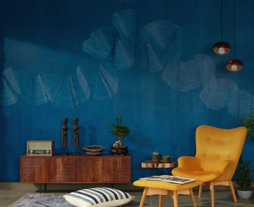
SP: We deliberately chose nature-inspired elements—the double-height art mural on the drawing-room wall, bird motifs on the stairs, the artwork in the bedrooms and passages. The avian theme is a reflection of free-flowing spaces. Integrating art into homes is core to our design philosophy.
SP: We used the brand’s paint, PU, stucco and fabrics from the Blue Edition collection from Asian Paints’ Ador range. They worked perfectly with our requirements and blended well with the design we wanted.
SP: We use a lot of Asian Paints products in our projects—paint, textures, fabrics, PU finishes. This time around, we opted for a new fabric series. We’ve used Ador and Pure fabrics before, so this was the first time we turned to blue. We like the feel and texture of the fabrics from Asian Paints collections, and this series was no exception. They’re also long lasting and high quality.
All images by Dhrupad Shukla
Drop your info and we will call you to book your preferred consultation slot our experts will reach out to you.
Yes, I would like to receive important updates and notifications on WhatsApp.
By proceeding, you are authorizing Beautiful Homes and its suggested contractors to get in touch with you through calls, sms, or e-mail.
Our team will contact you for further details.
We were unable to receive your details. Please try submitting them again.


