


Kitchens
- Category Name
- Kitchens
Get an approximate budget for your kitchen design by sharing your space details.

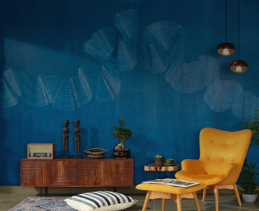
Search for Kitchens Wardrobes Doors & windows Curtains & Blinds Bathware Lights Design Ideas

Kitchen Budget Calculator

Speak to our design professionals
Share your info, we’ll book your slot.
Get tailored made designs from our interior design services by asian paints.
Will you be living in your space during the renovation?
 Previous Question
Previous Question
Previous Question
Please Select Date and Day
Appointment Date & time


Ahmedabad-based firm Architects at Work brings a high level of customisation to this Gandhinagar home that wraps warmth and character into a light-coloured space
This home by Ahmedabad-based firm Architects at Work offered a canvas for experimentation and discovery. “We custom-designed every element of this Gandhinagar apartment’s interiors—from the stitching on the sofa to the detailing of the beds, to patterns, finishes, even shutter designs,” explains architect Shweta Pandya. The firm’s client-centric designs balance functionality and precision with artistic expression. This, Pandya and her team did by making thoughtful material and decor choices. Using interior paint from Asian Paints to provide a suitable backdrop, they layered the house with texture, personality and warmth to reflect the homeowners’ vision for their spaces. For Pandya, founder of the multidisciplinary practice, the project was an opportunity to experiment creatively while giving the clients what they wanted. The outcome is a space that perfectly fits the individuals it is meant for. She unravels the nuance of custom-making a home for its inhabitants.
Shweta Pandya (SP): They were involved throughout the process. This home was incredibly special to the clients, and right from the outset, they had a clear idea about the meaningful, distinctive design they wanted. We aimed to craft a space that mirrored their warmth, artistic inclinations and generous spirit. And we had the freedom to interpret the brief in a way that was connected to their intent while expressing our creative perspective.
SP: The clients wanted a lightly coloured, bright space, with ample lighting even at night. We therefore used a single colour palette across most areas, resulting in a harmonious and elegant space. For instance, the master bedroom’s powder-blue-and-beige palette creates a calm ambience. We did incorporate colour in the kids’ rooms—red and pink—to reflect their personalities. The other rooms, however, continue with beige-toned materials for a seamless flow throughout the home. We also intentionally added touches of green to bring a sense of freshness.
SP: To start with, we experimented with distinctive detailing. The design journey begins right at the entry; a matte-finished textured panel greets visitors, accompanied by enlarged bird motifs to symbolise a warm welcome. Our aim was the pursuit of originality, whether it was choosing batten ceilings, adding motifs to the main door, using cane photo frames or creating F1-inspired wall art. We also maintained functionality in our design choices. For example, we introduced storage spaces tucked into graceful curves and floating Corian shelves and side tables suspended against sculpted backdrops.
Another consideration was to design surfaces that would blend seamlessly into their surroundings. In the kitchen, every door opening into the space was clad in the same material as the walls, unifying shutters, doors and wall planes into one continuous surface. We applied a similar approach to bathroom doors, integrating them into the interior finishes.
SP: It was a deliberate decision. This idea to let surfaces flow uninterrupted and dissolve sharp corners offers a fresh lens through which to experience the interiors. Furthermore, it reinforced our vision of creating spaces that feel unified, fluid and endlessly connected. Every space in this home celebrates personalisation. Every element, from the smallest handle to the largest furniture piece, was customised to reflect the client’s lifestyle, preferences and story.
SP: We selected colours and PU paints to ensure consistency, durability and a premium finish across all surfaces. The brand’s extensive shade range allowed us to fine-tune tones to match our vision. On the other hand, the high-quality PU coatings provided a smooth, refined texture that elevated both furniture and wall finishes. This choice not only guaranteed long-lasting performance but also contributed to the cohesive, detailed look that defines the interiors.
SP: This home essentially became a playground of material exploration. Certain textures, stretch ceilings, cane frames and wicker-sandwiched shutters made their debut in our work. Each new experiment felt like unlocking another layer of design possibility. Cane, with its graceful flexibility, became both structure and ornament, capable of taking any form we imagined. At the same time, its delicate weave filtered light and sight, creating a sense of openness and transparency. In every detail, these materials didn’t just fill the space; they shaped its character.
All images by MK Gandhi Studio
Drop your info and we will call you to book your preferred consultation slot our experts will reach out to you.
Yes, I would like to receive important updates and notifications on WhatsApp.
By proceeding, you are authorizing Beautiful Homes and its suggested contractors to get in touch with you through calls, sms, or e-mail.
Our team will contact you for further details.
We were unable to receive your details. Please try submitting them again.